Building a landig page is easy, the hard part comes when, in addition, we want it to have a high conversion rate. As you can guess, you have to pay a lot of attention to the proper construction of it… you see, here there is nothing that can be done in “any way” otherwise, all the effort that we have spent in any part of the process will be wasted time.
I am going to leave you with a structure of the steps to follow when approaching the creation of a landing page. It works for me. With the structure in front of us, we can follow the steps without deviating or losing sight of the main objective. It is important to be very clear about the objective we want to achieve before starting to set up a successful landing page.
Be clear about our objectives
As I mentioned before, the first thing we must be clear about is what will be our goal? That is, ask yourself, what do I want to achieve when the user clicks on my ad and arrives at my landing page? We will not build it in the same way if our objective is to sell a specific product, or, on the contrary, if our objective is to get the user to fill in a form.
And as a picture is worth a thousand words, I leave you the images of two landig pages. The first one with a sales objective and the second one with a lead capture objective.
Generate a new offer
And of course, this is not easy either… To achieve a good offer, we must be clear about several concepts.
- The product: the PROTAGONIST! Please, don’t fall into a very typical mistake and give it a secondary role. The product is always the protagonist in the landing page. Many times we make a mistake and give an excessive prominence to the incentive, leaving the product in second place… we CAN NEVER DO THIS.
- Price: this is the most critical factor, due to the repercussions it has on profitability. Let me explain a little more.
Imagine that you have two proposals for your new product launch strategy, and in this strategy, for example, you want to test the price for the launch offer in order to have a higher sales rate.
You might be thinking: the cheaper it is, the more it will sell?
Well, this is not always the case. For example, there are products that have more credibility with a higher price.
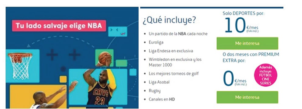
Example of price: small quantity and prominence. (Source: movistar.es)
- The incentive: the incentive is a response enhancer or accelerator: It is important that the incentive is coherent and related to the product we are offering. Moreover, it should not be more important than the product itself. And finally, we must not abuse incentives. It is not possible to survive and create a good brand image by constantly offering incentives.
- Deadline: setting a deadline accelerates the response rate and therefore conversion.
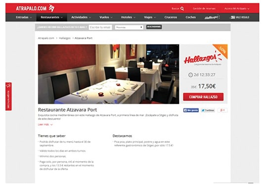
Example of an offer with a deadline (Source: atrapalo.com).
- Payment facilities: if your goal is to sell, it is important that you give users the option to choose the way they want to pay (by card, transfer, cash on delivery, Paypal…) If, in addition, we give them the opportunity to finance, even better. I know this is not easy, but don’t worry, we cannot always have the capacity to apply all the recommendations, I just want you to understand that the better payment facilities you offer, the better sales ratios we will obtain.
- Guarantees: including a satisfaction guarantee always provides greater security and minimises possible obstacles to purchase. If the user perceives that their risks are minimal, it will be easier for them to make the purchase.
- Call to action: clear, eye-catching and that leaves no room for doubt.
An inadequate design, in order to respond, can cause us to lose up to 80% of potential responses. The call to action must be unashamedly clear. For example, if we want to sell a product, a good call to action would be a button with a clear literal, for example “BUY NOW”.
Visual and attractive design
The landig page must be attractive and with a visual design coherent with our objective.
Keep in mind that when the user arrives at the landing page, after clicking on the advert, they should find a design that satisfies them and makes it pleasant for them to stay to find out more. If we get to a page where the design is bad or sloppy, we probably won’t even start reading. It has to feel like being read. And we must provide tangibility to the product offered, whenever possible (photo of the product, service or professional).
Structure of the message
Of course, and as it could not be otherwise, the structure of the message is also fundamental.
Headline
The results will be much better if we have a good headline.
It must answer the question: what are we going to talk about?
It must be clear and descriptive. It should appeal to the reader’s interests.
If there is something new, let us know (“Women’s shoe for the New Season 2021…”)
Subtitle
The famous USP (Unique Selling Preposition), that is, we must highlight the benefit or differential and fundamental characteristic of the product we are offering. Among all the benefits, we must highlight the most important one, the one that makes it unique and relevant for the potential customer.
Sales argumentation
Who is it aimed at? We must identify the target audience to whom our offer is addressed. We will reach our target audience much better if we use a striking subject line and a main image that is coherent with what we are offering.
We will reaffirm the positive aspects of the product: it is important that the product card appears. It is essential that the user does not have to leave the landing page to look for information about the product offered.
How to write texts that sell
Writing is an art, and if it is also to sell, it is almost a gift. But the question is clear:
How should I write the text of my landig page so that it sells?
Ask yourself
Before you start writing, you should ask yourself a series of questions and find the answers. My advice is to take a pen and paper, and write down the questions and the answers. Don’t start writing until you find the answers to all the questions.
- What is my goal?
- Who am I targeting?
- What do I think about the product or service?
- What do I want users to do when they get to the landing page?
- What is the most important promise I am going to make?
- Why should they believe me?
We start writing
We should start with a lead and end with a call to action.
Take care of the order of the landing page elements.
Keep in mind that users, when they land, browse in two or three seconds before they start reading… If what they find is not attractive and easy to follow, they won’t even start reading.
Don’t write long texts
My advice is that you should not write long texts, as it is more difficult to keep the reader’s attention.
If sentences are longer than 32 words on average, it will be difficult to concentrate on the text. It is interesting to use all resources to shorten them (hyphens, commas, semicolons, etc.)
Sentences of eight words or less are easier to read. The average sentence length should not exceed 15 words. Paragraphs should contain only one idea or, at most, two.
Do not include links
That can mislead the reader and take him/her to another page, you will only make him/her lose the main thread of your message.
Having said that, I leave you with an image that I found very explanatory of how a landing page should be structured.
I know I have not discovered America, but if I have managed to clarify some things or reaffirm others that you had in doubt, my goal is accomplished.
Remember: Practice gives you an experience that will improve your landing pages. Don’t be afraid to take the plunge, but do analyse the results in order to make improvements and reach your goal.


