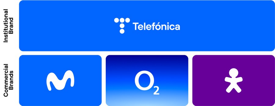
Telefónica is our master brand and is the one that heads on corporate and institutional communications at a global level. It is the institutional brand that communicates with society, investors, MNC’s and large companies, governments and international organizations.
The brand architecture model adopted maximizes the value of our brands and gives them sufficient flexibility to adapt to the new realities of our markets and the needs of the business.
Therefore, at local level, the commercial brand is the one that has a relationship with the different stakeholders, both for B2C and B2B, and is the one that leads all communications: Movistar for Spain and Hispanic America, O2 in Europe and Vivo in Brazil. Only in the case of Spain, the B2B segment is marketed through Telefónica Empresas.
OUR TELEFÓNICA BRAND
Every day, better connected
Almost 100 years ago, Telefónica was born focused on connecting people through voice. In the 80’s our identity changed to reflect the automation of our service and the internationalization of our company… and was subsequently refreshed to reflect the first data and mobile networks. The classic logo, friendly and human in appearance has been used since 1998 and began our era as a true multinational company, where our business model went from voice to data and content.
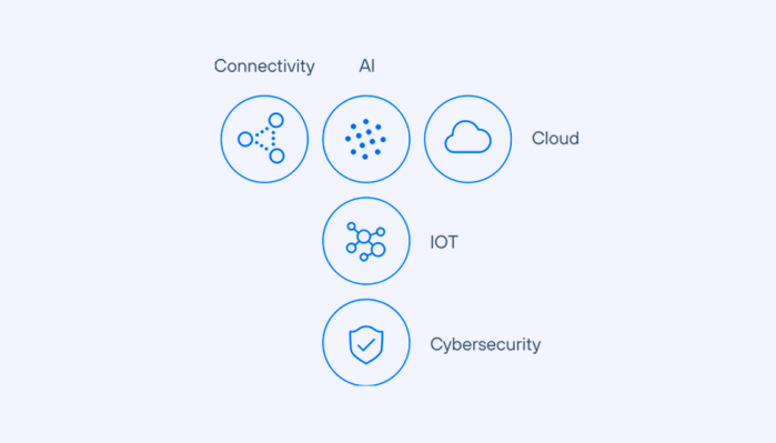
Transformation is in our DNA. In recent years, Telefónica has continued to renew itself without stopping: commoditizing fibre, deploying new 5G networks, phasing out copper, diversifying our business model and creating new technological companies in areas such as IoT, Big data, Cloud, cybersecurity or new infrastructures.
And because of all that, our identity now reflects this new Telefónica. That’s why we’re changing our identity, drawing from our history to project ourselves into the future. Because our legacy is everything that is still to come.
A visual language that combines both flexibility and simplicity, to be modern, dynamic and digital, that’s consistent with our history and perceived as human and close.
Our logo is based on the one we released in 1984, simplifying the five circles which reflect the five geographies where we are present (Spain, United Kingdom, Germany, Brazil and Hispanic America) or the five strategic axes of our transformation plan. But more than just a new logo, we use the circles as a basic element in our new identity.
We can change our logo as many times as it’s needed, but we maintain our purpose that we’ve had for almost 100 years – to make our world more human by connecting lives. To help companies take advantage of what the digital world has to offer, and to create a more sustainable and inclusive society.
We work each day so that we can all be better connected. Because a better-connected world is a more human world.
OUR COMMERCIAL BRANDS
Click on each of them to learn more: